Hockey Sushi
Branding • Packaging • Editorial Layout • Typography
Modernizing a small-town sushi brand with a playful, sports-inspired identity
Tools
Adobe Illustrator
Overview
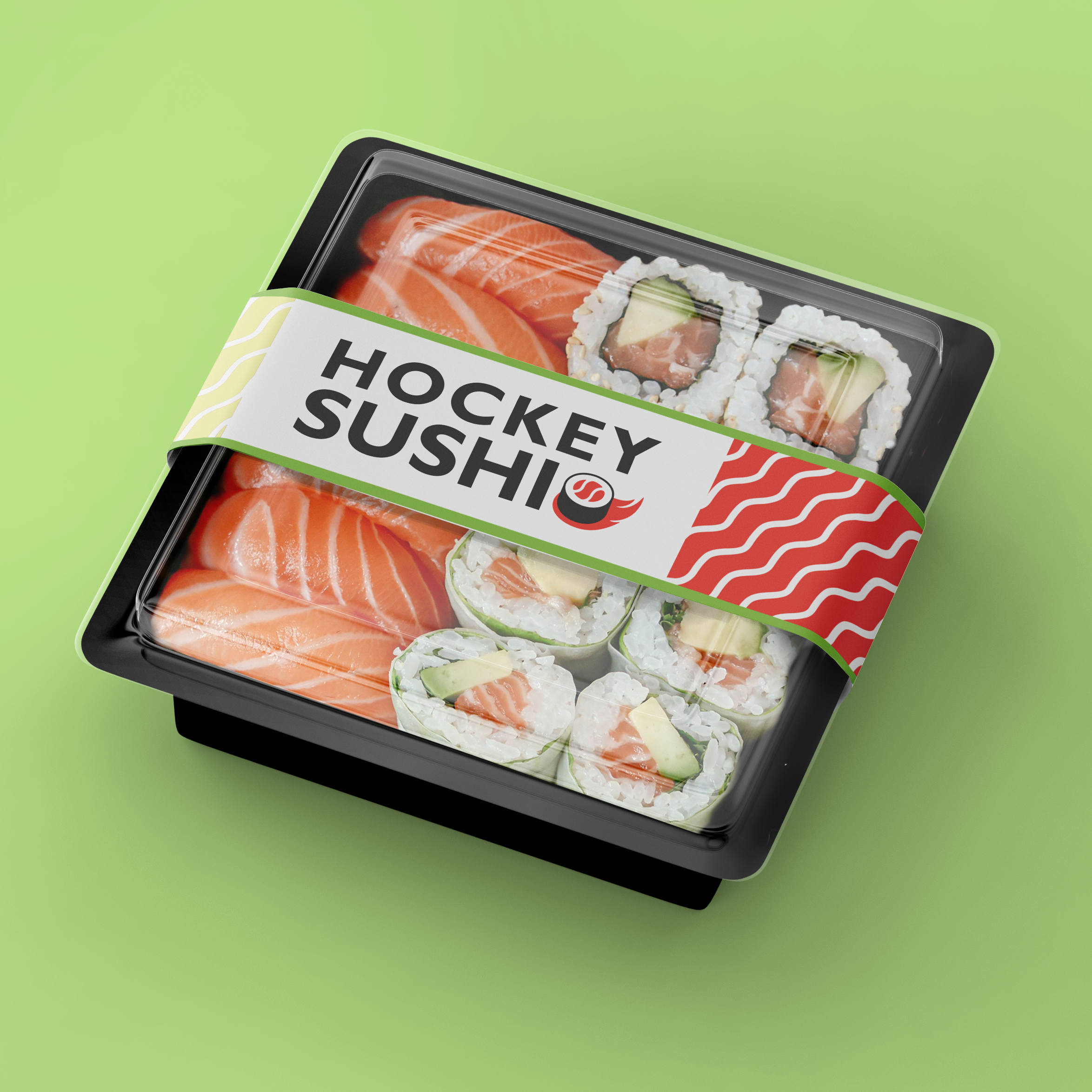
A conceptual brand redesign for Hockey Sushi, a local all-you-can-eat restaurant known for its casual atmosphere and community feel. The goal was to refresh the brand identity to better reflect its lively, approachable personality while appealing to a modern audience.
The Problem
The original branding relied heavily on outdated, overly traditional design elements that didn’t reflect the restaurant’s actual atmosphere. The designs felt cluttered and difficult to navigate, and the visual identity lacked cohesion across touchpoints.

Audience
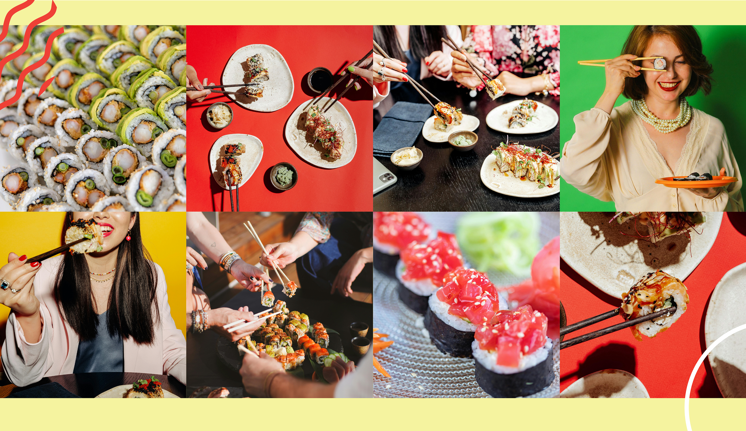
Families, students, and young adults in a
small-town Canadian setting: customers looking for a fun, affordable dining experience rather than a formal one.
Creative Direction
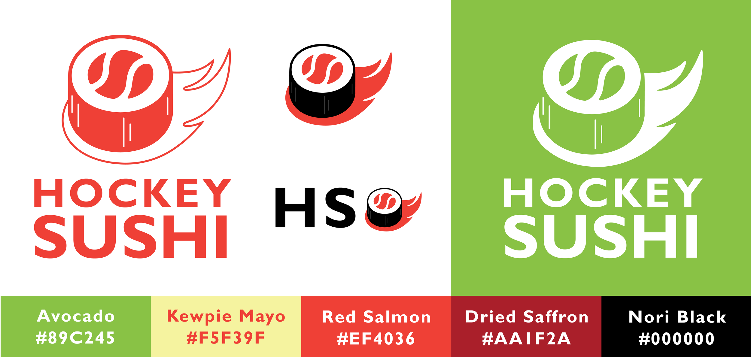
The redesign blends clean, modern layouts with playful,
sports-inspired elements. Drawing from Canadian hockey culture, I introduced bold typography, simplified iconography, and a brighter, more inviting colour palette to create a sense of energy and familiarity.
Brand Elements
Bold, approachable typography
Clean layout system
Subtle sports inspired graphics and motifs
Bright, friendly colour palette
Solution
The final design transforms Hockey Sushi into a brand that feels modern, welcoming, and distinctly local. The updated design improves usability while the new visual identity reinforces the restaurant’s fun,
community-driven atmosphere.
Reflection
This project allowed me to explore how branding can better align with a business’s real-world experience. I focused on balancing personality with usability - ensuring the design felt fun and engaging without sacrificing clarity.