Loco Mints
Packaging • Branding • Illustration • Character Design
Playful, character-driven packaging designed to appeal to kids and parents alike
Tools
Adobe Illustrator, Adobe Photoshop
Overview
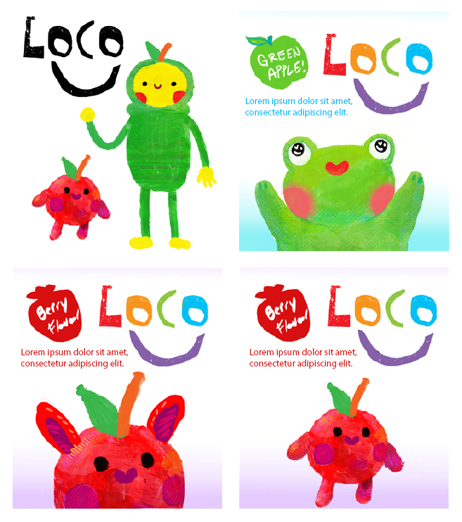
Loco Mints is a conceptual packaging project developed as part of a graphic design course at Sheridan College. The project involved creating a brand identity, including logo design, character illustration, and pouch packaging for a mint product aimed at a younger audience.
The Problem
Mint packaging is typically designed for adults, often lacking visual appeal for younger consumers. This project explores how to create packaging that feels fun and engaging for children while still maintaining clarity and trust for parents.
Audience
Children and their parents - specifically families looking for approachable, kid-friendly products that feel both fun and safe.
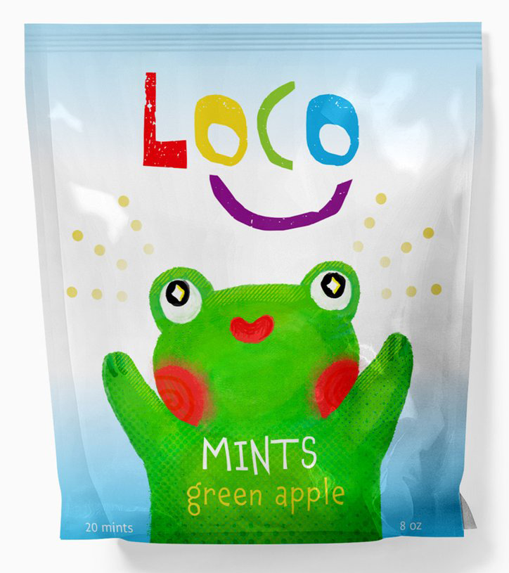
Logo / Nameplate
Designed to feel bold and playful, with handcut letter forms that reflect the product’s fun, approachable personality.
Creative Direction
The visual identity leans into bright colours, expressive character illustration, and cut-and-paste typography to create a friendly and approachable feel. The goal was to capture attention on the shelf while communicating a sense of safety and simplicity.
Packaging Layout
The pouch design balances visual playfulness with clear hierarchy, ensuring key information remains easy to read for parents while still feeling exciting and colourful.
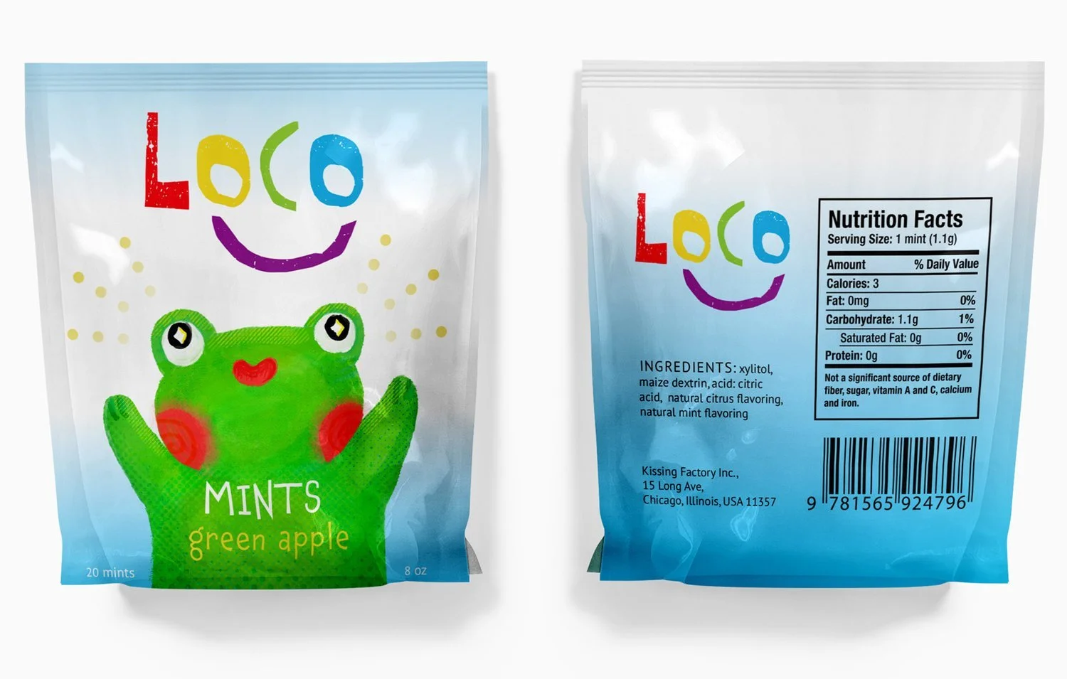
Solution
The final packaging presents a cohesive, character-driven brand that stands out visually while remaining approachable and easy to understand. It successfully balances playful appeal with functional clarity
Reflection
This project helped me explore how illustration and branding can work together within packaging design. I focused on balancing expressive visuals with practical considerations like readability and audience trust.